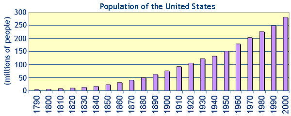
- Listed below are the historical population estimates of the
United States...
| Year |
Total Population |
|
Year |
Total Population |
| 1790 |
3,929,214 |
1900 |
75,994,575 |
| 1800 |
5,308,483 |
1910 |
91,972,266 |
| 1810 |
7,239,881 |
1920 |
105,710,620 |
| 1820 |
9,638.453 |
1930 |
122,775,046 |
| 1830 |
12,866,020 |
1940 |
131,669,275 |
| 1840 |
17,069,453 |
1950 |
150,697,361 |
| 1850 |
23,191,876 |
1960 |
179,323,175 |
| 1860 |
31,443,321 |
1970 |
203,302,031 |
| 1870 |
39,818,449 |
1980 |
226,545,805 |
| 1880 |
50,155,783 |
1990 |
248,709,873 |
| 1890 |
62,947,714 |
2000 |
281,421,906 |
- Construct a histogram (a.k.a. a bar chart) depicting the
U.S. population over the past two centuries.
- According to the "trend" observed in your graph, what
would you estimate the population of the U.S. to be in
approximately the year 2010?
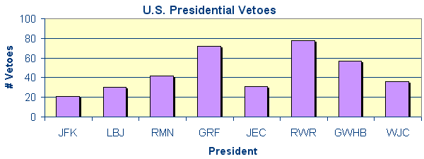
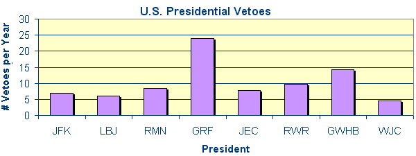
- The number of
congressional
bills vetoed by the President of the United States from 1961
to 2001 is given in the table below:
| President |
Period |
Total # Vetoes |
| Kennedy, John F. (D) |
1961-1963 (3 yrs) |
21 |
| Johnson, Lyndon B. (D) |
1963-1969 (5 yrs) |
30 |
| Nixon, Richard M. (R) |
1969-1974 (5 yrs) |
43 |
| Ford, Gerald R. (R) |
1974-1977 (3 yrs) |
66 |
| Carter, James E. (D) |
1977-1981 (4 yrs) |
31 |
| Reagan, Ronald W. (R) |
1981-1989 (8 yrs) |
78 |
| Bush, George W.H. (R) |
1989-1993 (4 yrs) |
44 |
| Clinton, William J. (D) |
1993-2001 (8 yrs) |
36 |
- Construct a histogram (a.k.a. a bar chart) for this
data, where each president is represented on the horizontal
axis and the number of vetoes is represented on the vertical
axis.
- From the graph in part a (above), which president vetoed
the most and which vetoed the least?
- Create a similar histogram using the average number of
vetoes enacted per year where each president is represented
on the horizontal axis.
- From the graph in part c (above), which president vetoed
the most often and which vetoed the least often?
- Comparing the graphs in part a (above) and part c
(above), describe how the first graph might be used to
mislead an unsuspecting reader.
- Figures (in billions of dollars) for the U.S.
National Debt, obtained from the U.S. Treasury's
Dept. of Public Debt
over the past several decades are listed in the table below:
| Year |
Total Debt |
| 1940 |
43.0 |
| 1950 |
256.1 |
| 1960 |
284.1 |
| 1970 |
370.1 |
| 1980 |
907.7 |
| 1990 |
3,665.3 |
| 2000 |
5,674.2 |
Construct a frequency polygon (a.k.a. a line graph)
depicting the United States' national debt over approximately
the past sixty years.
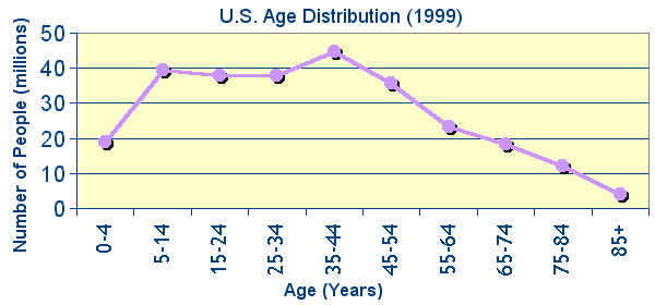
- According to the Bureau of the Census data, the number of
persons residing in the United States during 1999 was
272,690,813. The age class-intervals for residents is given in
the table below:
| Age |
Number of People |
|
Age |
Number of People |
| 0-4 |
18,942,142 |
45-54 |
35,802,358 |
| 5-14 |
39,495,230 |
55-64 |
23,389,085 |
| 15-24 |
37,773,512 |
65-74 |
18,218,248 |
| 25-34 |
37,935,812 |
75-84 |
12,146,695 |
| 35-44 |
44,812,649 |
85+ |
4,175,082 |
Construct a frequency polygon (a.k.a. a line graph)
depicting the age class-intervals of persons residing in the
U.S. for the year 1999.
- According to the CDC records, there were 143,928 Americans
who died of external (non-natural) causes in 1999...
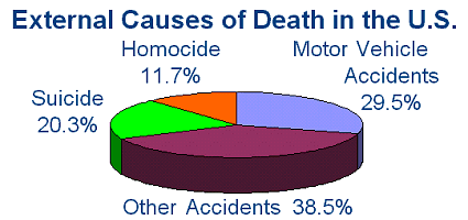 Using the graph above, determine the number of Americans who
died due to:
Using the graph above, determine the number of Americans who
died due to:
- Homocide
- Suicide
|
- Motor Vehicle Accidents
- Other Accidents
|
- A typical 150-lb human being consists of the
following elements (approximately by weight)...
| Element |
Weight (lbs) |
| Oxygen (O) |
97.5 |
| Carbon (C) |
27.0 |
| Hydrogen (H) |
15.0 |
| Nitrogen (N) |
4.5 |
| Calcium (Ca) |
3.0 |
| All Others |
3.0 |
- Construct a circle graph (a.k.a. a pie chart) for the
above data.
- Using your own body weight, determine your body's
approximate composition for each element by weight.
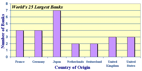
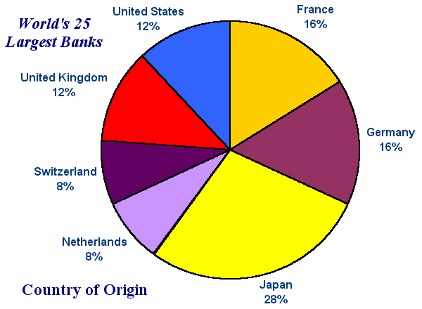
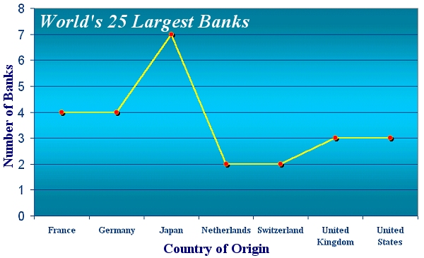
- Shown below is a frequency polygon (a.k.a. a line graph)
depicting the countries of residence for the twenty largest
banks in the world...
- Construct a histogram (a.k.a. a bar chart) representing
this information.
- Construct a circle graph (a.k.a. a pie chart)
representing this information.
- Of the three graphs representing the world's 25 largest
banks (in exercise #7 above), which one do you find the most
appealing? Explain why, citing reasons such as ease of
understanding, accuracy, aesthetics, etc.
|